
Why Every Business Needs A Responsive Website In 2026
Picture this: someone searches for your business on their phone, taps your website, and has to pinch and zoom just to read your phone number. What do they do next? They leave — and land on a competitor's site that actually works on mobile.
This scenario plays out thousands of times a day, across every industry. And in 2026, it's simply not a risk businesses can afford to take. Responsive design isn't a "nice technical detail" anymore — it's the baseline expectation for any website that wants to be found, trusted, and used.
This guide breaks down exactly what responsive design means, why it matters more than ever, and what happens when businesses get it wrong.
What is Responsive Design?
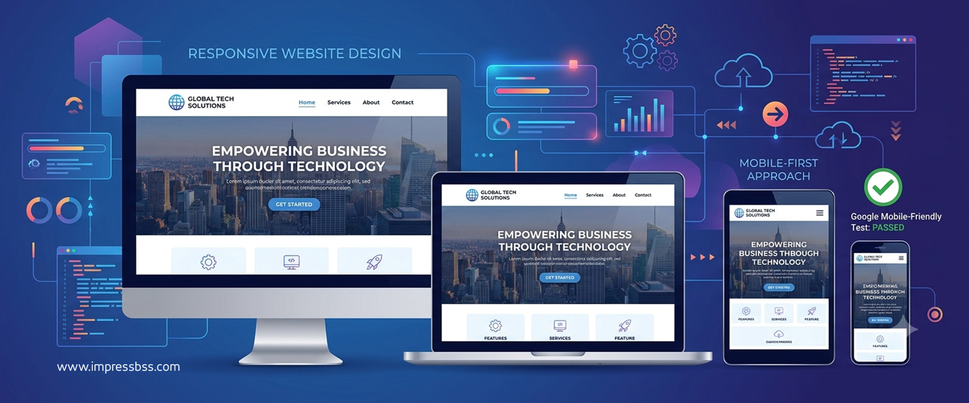
Responsive design means your website automatically adapts its layout, images, and content to fit whatever screen it's being viewed on — a smartphone, tablet, laptop, or large desktop monitor — without requiring a separate mobile site.
Instead of building one fixed layout and hoping it looks fine everywhere, responsive websites use flexible grids, scalable images, and CSS media queries to reflow content based on screen size. A three-column layout on desktop might become a single stacked column on mobile, with navigation collapsing into a simple menu icon.
The core idea: one website, one URL, one codebase — but an experience that adjusts intelligently to every device.
This is different from older approaches like building a separate "m.yoursite.com" mobile version, which meant maintaining two websites, duplicating content, and constantly keeping both in sync. Responsive design solves that by being genuinely one adaptable site.
Mobile Usage Statistics You Can't Ignore
The numbers make the case better than any opinion could:
- Mobile devices account for the majority of global website traffic, with many industries seeing 60-70% or more of visits coming from smartphones
- A large share of local searches — "near me" queries in particular — happen on mobile devices, often while people are actively out and about
- Mobile users are significantly more likely to abandon a site that isn't optimized for their screen, often within the first few seconds
- Voice search, which is overwhelmingly conducted on mobile devices and smart speakers, continues to grow as a discovery method for local businesses
For hospitals, this means anxious patients searching for urgent information on their phones. For educational institutions, it means parents and students browsing course details during a commute. For manufacturers, it means procurement teams checking specifications on a tablet during a site visit. Mobile isn't a secondary audience anymore — for most businesses, it's the primary one.
Google Mobile-First Indexing
Here's something many business owners don't realize: Google predominantly uses the mobile version of your website for indexing and ranking, not the desktop version. This is called mobile-first indexing.
What this means practically:
- If your mobile site has less content, fewer links, or missing elements compared to desktop, your rankings can suffer — because Google is largely evaluating what mobile users actually see
- Page speed on mobile devices is a direct ranking factor, tied closely to Core Web Vitals
- Mobile usability issues — text too small to read, clickable elements too close together, content wider than the screen — can actively hurt your search visibility
- A responsive design that serves the same content and structure across devices avoids the risk of inconsistency between mobile and desktop versions entirely
In short: if your website isn't built responsively, you're not just risking a poor user experience — you're actively working against your own SEO.
Benefits of Responsive Websites
SEO Benefits
- Single URL structure — no duplicate content issues from maintaining separate mobile and desktop sites
- Easier link building — all backlinks point to one version of your site, consolidating authority instead of splitting it
- Better crawl efficiency — search engines only need to crawl and index one set of pages
- Improved Core Web Vitals scores — well-built responsive sites tend to perform better across load speed, interactivity, and visual stability metrics
- Higher rankings in local search — since mobile usability is factored into how Google evaluates and ranks local business listings
User Experience Benefits
- Consistent experience across devices — visitors get the same content and functionality whether they're on a phone or a laptop
- Faster, more intuitive navigation — thumb-friendly menus, appropriately sized buttons, and readable text without zooming
- Reduced friction on forms — mobile-optimized forms are easier to fill out, reducing abandonment
- Better accessibility — responsive design principles often overlap with accessibility best practices, benefiting users with different devices and abilities alike
- Professional credibility — a site that works flawlessly across devices signals that a business is established, modern, and trustworthy
Lead Generation Benefits
- Higher conversion rates — visitors are far more likely to complete a form, make a call, or book an appointment when the process is smooth on their device
- Reduced bounce rates — fewer visitors leave immediately, giving your content and calls-to-action more chance to actually work
- Click-to-call functionality — especially valuable for service businesses, clinics, and hospitals where mobile users often want to call immediately rather than fill out a form
- Better ad performance — if you run paid search or social ads, a responsive landing page directly improves conversion rates and lowers cost-per-lead, since most ad clicks originate from mobile
- Wider reach — capturing mobile users who would otherwise bounce means access to a significantly larger pool of potential leads
Put simply: responsive design doesn't just make your site look better — it directly impacts how many visitors turn into actual customers, patients, students, or clients.
Common Responsive Design Mistakes
Even businesses that "have" a responsive website often get the details wrong. Watch out for:
- Text too small to read without zooming — a surprisingly common issue on sites that were "responsive" in theory but never properly tested on real devices
- Buttons and links too close together — frustrating and error-prone on touchscreens, leading to accidental taps and lost conversions
- Images that don't scale properly — oversized images that slow load times, or images that get awkwardly cropped on smaller screens
- Hidden or hard-to-find navigation — overly minimalist mobile menus that bury important pages several taps deep
- Slow mobile load times — often caused by unoptimized images, heavy scripts, or cheap hosting that wasn't built with mobile performance in mind
- Desktop-first thinking — designing for a large screen first and "shrinking it down" for mobile, rather than genuinely designing mobile-first
- Forms that are painful on mobile — too many fields, small input boxes, or no autofill support
- Pop-ups that take over the entire mobile screen — a major usability and SEO red flag, since intrusive interstitials are specifically penalized by Google on mobile
- Inconsistent content between mobile and desktop — trimming down mobile content so aggressively that important information (and SEO value) is lost
- Not testing on real devices — relying only on browser resize tools without checking actual phones and tablets, where rendering quirks often show up
Avoiding these mistakes requires genuine testing across real devices and screen sizes — not just assuming a "responsive" label on a template means the job is done.
Why This Matters Across Every Industry
- Hospitals & clinics: Patients searching urgently on mobile need fast-loading pages, easy click-to-call, and simple appointment booking — friction here has real consequences.
- Educational institutions: Parents and students browsing on the go need mobile-friendly admission forms, course details, and campus information.
- Manufacturers & B2B companies: Procurement teams and engineers increasingly research specifications and request quotes from tablets and phones during site visits or meetings.
- Startups & SMEs: First impressions matter even more with limited brand recognition — a broken mobile experience can end a potential customer relationship before it starts.
- E-commerce brands: Mobile shopping continues to grow every year; a non-responsive checkout process directly costs sales.
No matter the industry, the underlying truth is the same: your mobile visitors are not a secondary audience to accommodate — for most businesses today, they're the majority.
FAQs
1. Is responsive design the same as mobile-friendly design? They're closely related but not identical. Responsive design is a technical approach that adapts layout to any screen size, while "mobile-friendly" is a broader description of the outcome. A well-built responsive site is, by definition, mobile-friendly.
2. Does responsive design affect SEO rankings? Yes, significantly. Since Google uses mobile-first indexing, a responsive design directly influences crawlability, Core Web Vitals scores, and overall search visibility.
3. Can an old website be made responsive, or does it need a rebuild? It depends on how the original site was built. Some sites can be retrofitted with responsive CSS, while heavily outdated or rigidly coded sites often require a more substantial rebuild for proper results.
4. How can I check if my website is actually responsive? Beyond resizing your browser window, test on real mobile devices and tablets, and use tools like Google's mobile-friendly testing resources to identify specific usability issues.
5. Do responsive websites cost more to build than fixed-width websites? Not significantly, and in 2026, virtually all professional website builds are responsive by default — it's considered a standard requirement, not a premium add-on.
6. What's the biggest mistake businesses make with mobile design? Treating mobile as an afterthought — designing for desktop first and adapting downward — rather than genuinely prioritizing the mobile experience from the start of the design process.
7. Does responsive design help with local SEO specifically? Yes. Since a large share of local searches happen on mobile, a fast, easy-to-navigate responsive site directly supports better local search performance and higher conversion from "near me" searches.
Conclusion
Responsive design in 2026 isn't a technical checkbox — it's the foundation of how your business shows up, functions, and converts across every device your customers actually use. From SEO visibility to user trust to lead generation, the ripple effects of getting mobile experience right (or wrong) touch nearly every part of your online presence.
If your website hasn't been properly tested and optimized for mobile recently, it's worth a closer look before it quietly costs you leads. Partnering with an experienced web design company in Chennai or exploring a modern, flexible WordPress website design build can get your site fully responsive and performing the way today's mobile-first audience expects. If SEO visibility is a priority alongside design, it's also worth talking to a specialized SEO company in Chennai to make sure your mobile experience and search performance are working together, not against each other.
For more on building a future-ready website, explore our Website Design Trends 2026 guide, our Website Speed Guide for performance best practices, and our Website Mistakes Guide to make sure your site isn't quietly losing leads elsewhere.